Sample DH 1 — Section C6 of Early Modern London
Based on a visualization concept, the map of early modern London shows the physical area of Shakespeare’s London before the Great Fire. The mapping of all the prominent landmarks and features of the city are clearly shown to help the viewer understand more about the space of the city at that time period. This mapping and visualization can show the reader what Shakespeare, for example, might have been referring to in his plays and where that location is in a very simplistic form. This map can really enhance the enjoyment of everything that you come across pre-1666 (that is pre-Fire) in London. This map of early modern London is represented perfectly by this visualization that gives a good representation of where everything is, while still being able to give good demonstration of how important that monument or landmark was and giving a valuable definition. Many parts of this map are interactive and informative to show the viewer what early modern London was truly like without actually being there. Not only did Shakespeare write during the 17th century, another famous writer who wrote the book Don Quixote, Miguel de Cervantes, but also both passed away in 1616. The city of early modern London passed away in 1666, which ends the practical use for our early modern London map.
If you look deep enough into the map of early modern London, it becomes a very deep read. A historian will be able to learn all they would like to know about London before 1666 all in one interactive comprehensive map. This is such a good database for this certain time period that it can almost become too dense. There are so many facts in such small portions of space that it can be at times too much to understand, which is a nice problem to have when creating a very in depth interactive map.

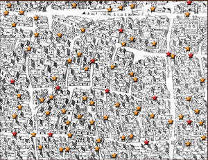
In certain sections of the map, like the section shown in Figure 1 (first picture), there almost seems to be more stars than actual places, making it difficult to make out what the map actually looked like. This is not a good way to perform a digital archive. My recommendation would be to shrink the size of the hyperlinks so viewers would be able to see past them and see the landscape while also being able to check out the landmarks and learn about early modern London.